Эта страница целиком или частично не переведена. Просьба перевести её на соответствующий язык (русский).
Это руководство (поваренная книга, англ. Cookbook) представляет собой набор полезных кусков кода CSS, которые вы сможете использовать на своё усмотрение.
Учим CSS[]
Фоновые изображения[]
Если вы хотите изменить фоновое изображение вашей вики с помощью CSS, можете не смотреть этот пункт. Как правило, это можно сделать с помощью:
body.mediawiki {
	/* замените этот текст URL-адресом вашего изображения, которое вы хотите использовать в качестве фона */
	background-image: url("<URL>");
	/* изменяет цвет фона; можно указать цвет в шестнадцатеричном виде или по-английски (т.е. "red") */
	background-color: red;
	/* объединяет два или более фоновых слоя вместе с различными режимами смешивания, используйте одно из названий режима наложения, чтобы изменить внешний вид фона (например: "color-dodge", "screen", "multiply", "hard-light", "difference", "luminosity" */
	background-blend-mode: normal;
	/* установите значение "scroll", чтобы фон мог прокручиваться вместе со страницей, или "fixed", чтобы его положение оставалось неподвижным */
	background-attachment: scroll;
	/* выберите направление для расположения изображения (т.е. "top left" (вверху слева), "left center" (по центру слева), "right center" (по центру справа), и т.д.), сдвиг по горизонтальной/вертикальной осям (x% y%) или положение по осям в пикселях (xpos ypos). (примечание: эффект от значений в % и pos сочетается)> */
	background-position: top left;
	/* по умолчанию повторяет изображение и по вертикали, и по горизонтали, если оно полностью не помещается на экране; задав значение repeat-y изображение будет повторяться по вертикали, аналогично при repeat-x будет повторяться по горизонтали, а если же выставить no-repeat, то изображение появится в единственном экземпляре */
	background-repeat: repeat;
}
Иногда может потребоваться некоторая тонкая настройка, но это основы.
Message Wall user tags[]
This snippet by Caburum allows you to add a customizable "tag" to messages and forum posts by a specified user. It can be used to distinguish administrators, bureaucrats, the wiki's founder etc. It can be used for any purpose.
[class^='EntityHeader_name__'][href$="Username"]::after {
	content: " (Tag)";
	color: var(--theme-page-text-color);
}
Change Username to the username (make sure to replace any spaces with %20 or, if the name uses special characters, you can transform it in an URL Encoder and use its result) and change (Tag) to whatever you want to show after. You can type any other CSS rules to customize the appearance of the tag. The above example, in addition to adding the tag, makes the text color the same color as other text, but this can be changed.
CSS для конкретных целей[]
На Фэндоме имеется несколько встроенных классов.
.ns- Класс конкретного пространства имён
- На этой странице находится класс
.ns-0— класс основного пространства статей
/* Изменение цвета текста в пространстве имен «Участник» */
.ns-2 {
	color: black;
}
.theme-fandomdesktop-lightand.theme-fandomdesktop-dark- Класс автоматически добавляется на вики с тёмной темой
/* Изменение цвета ссылок на тёмных вики, но не на светлых */
.theme-fandomdesktop-dark a {
	color: white;
}
.page- Класс для конкретной страницы вики
- Класс этой страницы —
.page-CSS_Cookbook
/* Добавляет несколько стилей на определённую страницу */
.page-CSS_Cookbook h2 {
	font-weight: bold;
}
.wiki- Wiki specific class
- Например, класс для этой вики
.wiki-dev, для Викии Вики —wiki-ruwikies, а для Вики Сообществ —wiki-ruwikia
/* Добавляет оформление только для Dev Wiki */
.wiki-dev .portable-infobox {
	padding: 1px;
}
Преображаем вашу вики[]
Image styling[]
This CSS manipulates the appearance of a specific image on your wiki, use this CSS snippet below, replacing Filename.ext with an image on your wiki (for example: Example.jpg):
img[src*="Filename.ext"] {
	/* Apply filters to manipulate image color */
	filter: none;
	/* Combines color with the site background, and the image. (supported blend modes include "color", "color-burn", "color-dodge", "darken", "difference", "exclusion", "hue", "lighten", "luminosity", "multiply", "normal", "overlay", "plus-lighter", "saturation", "screen", and "soft-light" */
	mix-blend-mode: multiply;
	/* Set the opacity, to make the image opaque, or transparent. */
	opacity: 1;
	/* More CSS attributes */
}

/* Prevent effects from being used on file history, especially when hovering image on it's file page to enable viewing original images, incase vandalized. */
.filehistory img {
	filter: revert !important;
	mix-blend-mode: revert !important;
	opacity: revert !important;
	/* More CSS attributes */
}

#file img:hover {
	filter: revert !important;
	mix-blend-mode: revert !important;
	opacity: revert !important;
	/* More CSS attributes */
}
To apply CSS image manipulation for light and dark skins, place .theme-fandomdesktop- (for desktop), and .theme-fandommobile- (for mobile), with the class suffix light or dark before img.
Настройка затемнения[]
Чтобы настроить затемнение, которое появляется при просмотре изображения в лайтбоксе, используйте следующий CSS:
.blackout {
	background: #84dcff;
	mix-blend-mode: overlay;
}
Вы можете изменить параметр background: #84dcff; на нужный цвет и тип наложения mix-blend-mode: overlay; на необходимый соответственно.
Упростить настройку курсора вы сможете с помощью генератора кода (поставьте галочку в опции «Курсор»).
Gallery styling[]
This CSS snippet by ValleyMaster will change the default appearance of galleries.
/* Alters the whole gallery */
.wikia-gallery {
	/* CSS Attributes */
}

/* Alters each gallery item */
.wikia-gallery-item {
	text-align: center;
	padding: 0px;
	margin: 5px;
	background-color: rgba(0,0,0,0.1);
	border-radius: 1em;
	/* More CSS Attributes */
}

/* Removes the default border of the images */
.wikia-gallery-item .thumb .gallery-image-wrapper {
	border-style: none;
}
If you want a custom image border, remove border-style: none and replace it with border: _px solid color.
You may also apply a border-radius if you'd like, and this works even with border-style: none active.
/* Changes the default position of the images to center */
.wikia-gallery-position-left {
	text-align: center;
}

/* Alters the caption of the images */
.theme-fandomdesktop-dark .lightbox-caption {
	border-top: 1px solid #4d4d4d;
	border-bottom: 1px solid #4d4d4d;
	/* More CSS Attributes */
}

.theme-fandomdesktop-light .lightbox-caption {
	border-top: 1px solid #cecece;
	border-bottom: 1px solid #cecece;
	/* More CSS Attributes */
}
Expand/Collapse toggle button design[]
This CSS snippet will allow you to design the expand/collapse toggle button.
/* Alters the appearance of the toggle button. */
.mw-collapsible-text {
	/* CSS Attributes */
}

/* Removes the default square brackets (for design purposes) — from MediaWiki. */
.mw-collapsible-toggle-default:before, .mw-collapsible-toggle-default:after {
	display: none;
}

/* Changes the default position of the toggle button to left instead of right. — from MediaWiki. */
.mw-collapsible span.mw-collapsible-toggle {
	float: none;
	margin-left: 0;
	margin-right: 1em;
}
Sometimes, the toggle button may not be better on the left side. This CSS snippet by ValleyMaster will allow you to change the position back to right.
.float-right .mw-collapsible span.mw-collapsible-toggle {
	float: right;
}
To apply this, close the tag with mw-collapsible with <div class="float-right"></div>.
For example:
<div class="float-right">
<div class="mw-collapsible mw-collapsed">
text 1
<div class="mw-collapsible-content">
text 2
</div>
</div>
Table example:
<div class="float-right">
{| class="wikitable mw-collapsible mw-collapsed"
!Text 1
|-
|Text 2
|}
</div>
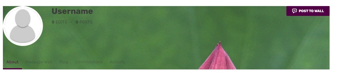
Block-style header[]
This CSS snippet by JustLeafy, makes the page header looks like a block style with a solid background color. It indirectly returns the style of the Oasis-style header.
.fandom-community-header {
	background: var(--theme-accent-color);
	color: var(--theme-accent-label-color);
	padding: 15px 20px 5px 20px;
}

.page {
	margin-top: 0;
}
Condensed header dropdowns[]
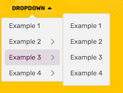
This CSS snippet by JustLeafy, makes the style of the dropdowns of the page header look more condensed.
.fandom-community-header__local-navigation .wds-dropdown__content {
	padding: 0 !important;
}

.fandom-community-header__local-navigation .wds-dropdown__content .wds-list.wds-is-linked > li {
	padding: 0 6px !important;
}
Wiki-themed scrollbar[]
This CSS snippet by Headquarter8302 styles the wiki's scrollbar with the current theme that is being applied, regardless of color and theme selection (light or dark). The snippet uses the relatively new scrollbar-color property introduced in the CSS Scrollbars Styling Module Level 1 spec.
:root {
  scrollbar-color: var(--theme-accent-color) var(--theme-accent-color--hover);
}
Line-height customization[]
Customizing line-height is useful for Indic scripts such as Devanagari, Bengali, Kannada, Odiya, etc due to mātrās (such ि, ी, ु and ू), flowing off the lines in specific locations and making it look untidy. It is recommended that all wikis in the mentioned languages use this:
.wds-community-header__sitename,
.fandom-community-header a,
#content h2,
#content h3,
#content h4 {
	line-height: 1.5;
}
Link customization[]
This CSS snippet was created by Cleverduck09 to customize what links wiki-wide look like on hover, once they have been visited, and when they haven't been visited or hovered on, input the following code:
/* What the link looks like when you haven't clicked/hovered on it */
a:link {
	color: CODE;
	background-color: CODE;
	text-decoration: CODE;
	text-shadow: CODE;
	/* More CSS Attributes */
}

/* What the link looks like when you've visited it */
a:visited {
	color: CODE;
	background-color: CODE;
	text-decoration: CODE;
	text-shadow: CODE;
	/* More CSS Attributes */
}

/* What the link looks like when you're hovering on it */
a:hover {
	color: CODE;
	background-color: CODE;
	text-decoration: CODE;
	text-shadow: CODE;
	/* More CSS Attributes */
}

/* What the link looks like when you click it */
a:active {
	color: CODE;
	background-color: CODE;
	text-decoration: CODE;
	text-shadow: CODE;
	/* More CSS Attributes */
}
Profile background[]
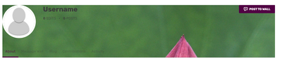
If you want to insert a background image that spans across of profiles of users, you can use:
#userProfileApp {
	/* insert URL to profile background image */
	background-image: url("<URL>");
}
Note: Add background-repeat: no-repeat; if you have added a wider image. They may not fit and will result in a repeating background.
Print/PDF sanitisation[]
This stylesheet by Headquarter8302 distills the print/PDF output to a more print and PDF friendly format by removing most if not all Fandom elements and only leaving the Infoboxes and the content articles, while also making a lot of the page content much more legible. If you have found some elements that should be removed or if you want this to be turned into a fully-maintained stylesheet, please harass Markus (the author of this snippet).
Remember to put this inside MediaWiki:Print.css, and not your Common.css.
:root {
	--pi-border-color: black !important;
}

.fandom-sticky-header,
.global-navigation,
#mixed-content-footer,
.bottom-ads-container,
.top-ads-container,
.global-footer,
div[class^="InlineEntityFormWrapper_inline-entity-form-wrapper"],
#WikiaBar,
.page-side-tools__wrapper,
.page-header__actions,
.page__right-rail,
.community-header-wrapper,
.mw-editsection,
.page-footer__categories .wds-icon.wds-icon-small,
div[class^="Filters_article-comments-filters"],
#mw-data-after-content {
	display: none !important;
}

:not(pre > *),
:not(.mw-highlight > *) {
	background: white !important;
	color: black !important;
}

.main-container, .resizable-container {
	max-width: none;
	width: 100%;
	margin: 0;
}
Настройка полосы прокрутки[]
Если вы хотите настроить полосу прокрутки вики, вы можете использовать эти селекторы CSS, чтобы применить к ней различные свойства оформления:
/* Делает полосу прокрутки шириной в 8 пикселей */
::-webkit-scrollbar {
	width: 8px;
}

/* Делает прямоугольник в полосе прокрутки чёрным */
::-webkit-scrollbar-track {
	background: black;
}

/* Делает фон полосы прокрутки зелёным */
::-webkit-scrollbar-thumb {
	background: #228B22;
}

/* Делает фон полосы прокрутки более тёмным оттенком зеленого при наведении курсора */
::-webkit-scrollbar-thumb:hover {
	background: #222;
}
Примечание: настройки полосы прокрутки поддерживаются только в некоторых браузерах, таких как Chrome, Opera и Safari.
/* Change all of the scrollbars using properties supported for Firefox browsers */
* {
	scrollbar-color: #888 transparent;
	scrollbar-width: thin;
}
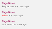
Подсветка имени участника[]

Этот CSS выделяет ссылки на страницу участника, его стену обсуждения, страницу вклада, журналы и список блогов:
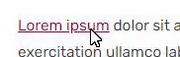
a[href$=":Ник_участника"],
a[href$="/Ник_участника"] {
	/* изменяет цвет имени участника */
	color: #006600 !important;
	/* делает ник жирным */
	font-weight: bold !important;
	/* изменяет шрифт имени участника */
	font-family: Arial !important;
	/* More CSS Attributes */
}
Измените «Ник_участника» на нужный; в примере выше #006600 означает цвет, которым будет выделен ник, а Arial — название шрифта. Вы можете удалить ненужные свойства, если они вам не нужны. Если вам нужно использовать ник, написанный кириллицей, воспользуйтесь данным конвертером (вставьте ваш ник в нижнее окошко и нажмите кнопку «Кодировать») Упростить настройку ников вы сможете с помощью генератора кода (поставьте галочку в опции «Цветные ники»).
a[href$=":Ник_участника"],
a[href$="/Ник_участника"],
a[href$=":Admin's%20Username"],
a[href$="/Admin's%20Username"]	{
	/* CSS Attributes */
}
In case there are other special characters in the username (such as & or ' ), those need appropriate encoding as well.
Change outline style[]
This minor CSS plug-in customizes the style of the outline. The outline means the blue border that appears when tabbing (using ↹ Tab to navigate a page). It is a style that is not to be confused with border. An outline is a line that is drawn around elements (outside the borders) to make the element "stand out".
a:focus {
	/* Sets the color of the outline */
	outline-color: green;
	/* Sets the amount of space between an outline and the edge or border of an element */
	outline-offset: 1px;
	/* Sets the style of the outline (e.g. dotted, dashed, solid etc.) */
	outline-style: solid;
	/* Sets the width of the outline */
	outline-width: 2px;
}
Note: Do not remove that outline as it is vital for making your wiki accessible to users who only use their keyboards.
Round corners on Special:Community[]
This snippet by Louky rounds corners of Community Page modules:
.community-page-card-module-header, .community-page-card-module {
	border-radius: 40px 40px / 40px 40px;
}
Pixelated images[]
This snippet by Rail makes sure that low resolution pixelart images are being displayed without antialiasing applied by Fandom's image processing service.
.mw-parser-output img {
	-ms-interpolation-mode: nearest-neighbor;
	image-rendering: -moz-crisp-edges;
	image-rendering: -o-crisp-edges;
	image-rendering: -webkit-optimize-contrast;
	image-rendering: crisp-edges;
}
Reduced motion[]
This CSS snippet will make the duration of all CSS animations and transitions in such a short time that they are not noticeable anymore, while keeping it functional in case there's scripts that depends on animations and/or transitions to work. This can be useful for people who don't like animations, have motion-triggered vestibular spectrum disorders or want to improve page performance. The code will take effect only if the user has the prefers-reduced-motion preference on their system set to true. Snippet from web.dev.
@media (prefers-reduced-motion: reduce) {
	*, ::before, ::after {
		animation-delay: -1ms !important;
		animation-duration: 1ms !important;
		animation-iteration-count: 1 !important;
		background-attachment: initial !important;
		scroll-behavior: auto !important;
		transition-duration: 0s !important;
		transition-delay: 0s !important;
	}
}
You can also remove the media query to apply it to the wiki no matter the user's preference.
[]
Allows links in the navigation bars to be keyboard-navigable (it's highly recommended to implement along with JumpToContent since it can drastically increase the amount of links keyboard users will have to navigate in each page before getting to its contents).
.wds-dropdown:not(.wds-is-touch-device):not(.wds-is-not-hoverable):is(:hover, :focus, :focus-within) .wds-dropdown__content,
.fandom-community-header__local-navigation .wds-dropdown__content .wds-list.wds-is-linked .wds-dropdown-level-nested:not(.wds-is-touch-device):is(:hover, :focus, :focus-within) > .wds-dropdown-level-nested__content {
	display: block;
}
Edit sections[]
Hidden edit sections[]
This CSS snippet by Александр III hides all edit links next to section headers.
.mw-editsection {
	display: none;
}
Change icon for edit sections[]
This CSS snippet by Laclale and KockaAdmiralac changes icon for all edit links next to section headers. You can change the URL that links to image.
.section-edit-pencil-icon, .mw-editsection .wds-icon {
	background: url('https://vignette.wikia.nocookie.net/ocraviutl/images/1/13/EditVester.png/revision/latest?path-prefix=ja') no-repeat;
}
.section-edit-pencil-icon use, .mw-editsection .wds-icon use {
	opacity: 0;
}
Transparent strikes[]
This CSS snippet by Leslie1289 makes <s> and related elements semi-transparent. Example.
strike, s, del {
	opacity: 0.5;
}
Semi-transparent page background[]
The background of the content area is currently opaque, meaning the wiki background image behind it is not visible. To set that background semi-transparent while keeping the color picked via Theme Designer, use:
.page__main {
	background-color: rgba(var(--theme-page-background-color--rgb), 0.96);
}
The value of 0.96 is the opacity and it can be increased or decreased, but it's not recommended to lower it too much since the background image behind might make the text hard to read.
The code above would still leave the right rail and the bottom Fan Feed opaque. In order to make them semi-transparent too, the following extended version can be used instead:
.page__main,
.page__right-rail,
#mixed-content-footer {
	background-color: rgba(var(--theme-page-background-color--rgb), 0.96);
}

.page__right-rail .rail-module {
	background: transparent;
}
Sticky search bar on Special:Search[]
This simple snippet by User:SuperDragonXD1 makes the search bar, alongside the related wikis and filters sidebar on Special:Search and Special:SearchCommunity.
/* Search bars being sticky */
.mw-special-Search form.unified-search__form, .mw-special-SearchCommunity form.unified-search__form {
	position: sticky;
	top: 42px;
	z-index: 1;
}

/* Tabs on the left being sticky */
.mw-special-Search .unified-search__layout__left-rail {
	position: sticky;
	top: 100px;
	align-self: flex-start;
}

/* Related community section being sticky */
.mw-special-Search .unified-search__layout__right-rail {
	position: sticky;
	top: 85px;
	align-self: flex-start;
}

/* General rule */
.mw-special-Search div#content, .mw-special-SearchCommunity div#content {
	overflow: unset;
}

/* Prevent overlapping of the search bar if there are more CSS customizations */
.mw-special-SearchCommunity .unified-search__result {
	margin: 8px;
}
FAB TOC only[]
This CSS snippet sets a middle ground between showing all Table of Contents (TOC) and not showing any of them, by hiding the TOC in the article but keeping the one in the Floating Action Button (FAB) on the top left of the page (or top right if you're on mobile). The in-page's TOC can still be accessed through keyboard navigation.
#toc:not(:focus-within) {
	clip: rect(1px, 1px, 1px, 1px);
	overflow: hidden;
	position: absolute;
}
Rail toggle button as FAB[]
The rail toggle button doesn't scroll with you as the buttons on the left side does, making you have to scroll to the top of the page to toggle the side bar, so this personal CSS snippet gives that specific button the same styling as the other Floating Action Buttons (FABs) so it follows you around when you scroll.
/* Adds FAB styling to the rail toggle button */
.page__right-rail > .right-rail-toggle {
	-webkit-box-pack: center;
	-webkit-box-align: center;
	align-items: center;
	background: var(--theme-page-background-color);
	border: none;
	border-radius: 50%;
	-webkit-box-shadow: 0 3px 12px 0 rgb(0 0 0 / 30%);
	box-shadow: 0 3px 12px 0 rgb(0 0 0 / 30%);
	color: var(--theme-link-color);
	cursor: pointer;
	display: -webkit-box;
	display: flex;
	height: 36px;
	justify-content: center;
	margin-bottom: 9px;
	margin-top: 18px;
	outline: none;
	padding: 0;
	position: sticky;
	top: 58px;
	-webkit-transition: color .3s;
	transition: color .3s;
	width: 36px;
}

.page__right-rail > .right-rail-toggle:focus-visible {
	outline: 2px solid var(--theme-link-color);
}

.page__right-rail > .right-rail-toggle:hover,
.page__right-rail > .right-rail-toggle:focus {
	color: var(--theme-link-color--hover);
}

.page__right-rail > .right-rail-toggle {
	float: right;
	transform: translateX(18px);
}

/* Restores rail's original position and width */
.right-rail-wrapper {
	transform: translateY(-63px);
	width: 100%;
}
HTML theme colors[]
This snippet sets the accent color for user-interface controls generated by some default HTML elements as well as the scrollbar. Note that accent-color is enabled by default only in recent browser versions, and color-scheme has wider browser support.
The following snippet assumes that your wiki is light-theme by default, but you can invert the color-scheme value to dark light if your wiki is dark-themed by default, and you also may want to change the class .theme-fandomdesktop-dark to .theme-fandomdesktop-light to properly update the color scheme for light theme.
/* Undefined/light theme */
:root {
	accent-color: var(--theme-link-color);
	color-scheme: light dark;
}

/* Dark theme */
.theme-fandomdesktop-dark {
	accent-color: var(--theme-link-color);
	color-scheme: dark light;
}
Sticky table headers[]
You can make table header cells follow your screen so users can permanently see what each column is about. To do so, you use the following CSS:
/* Allows sticky elements to work inside the page's content. */
#content {
	overflow: initial;
}
Then you can make header cells sticky. Here we will show two methods: one that only checks for the table class nd other that checks for each cell's class.
/* Method 1: check for table's class. All header cells of that table will be sticky. */
table.sticky-header th {
	position: sticky;
	top: 45px;
}

/* Method 2: check only for table header cells with the "sticky-header" class. */
table th.sticky-header {
	position: sticky;
	top: 45px;
}
[]
The following snippet aligns the footer section in mobile to not obstruct any elements above as it can clash with interactive maps and navboxes.
- Note: This snippet should only be added either to your personal CSS, or to your local
FandomMobile.css. It won't work if it's added elsewhere, or if mobile CSS hasn't been enabled for your community.
.article-footer {
	transform: unset;
}

.article-footer-item, .article-information-header, .wds-font-size-base {
	transform: unset;
}
Удаление стандартных элементов мобильной заглавной страницы[]
Данный код взят с Sky Children of the Light Wiki. Он удаляет элементы мобильной заглавной страницы, добавленные Фэндомом, оставляя только самые верхние элементы и полную версию заглавной.
- Примечание: Данный код только в ваш личный локальный CSS, или на страницу
MediaWiki:FandomMobile.cssОн не будет работать в другом месте.
.mobile-main-page__wiki-description {
	display: none !important
}

.mobile-main-page__trending-articles {
	display: none !important
}

.mobile-main-page__popular-categories {
	display: none !important
}

.mobile-main-page .mobile-hidden {
	display: block !important
}
Настройки участника[]
WikiEditor Syntaxhighlight Extensions[]
Personal CSS only: This CSS extension pack by Suggon adds a few visual fixes and syntaxhighlight features into the 2010 wikitext editor; some being inspired by VSCode.
- Enable editor overscrolling
- Fix occasional "disappearance" of text cursor
- Line highlight on mouse hover
- Comprehensible matching-brackets
- Outline for lines with matching-bracket
- Left border for lines between matching-brackets — handy for debugging nested parser functions
.CodeMirror {
	caret-color: var(--theme-page-text-color);
}
.CodeMirror * {
	transition-property: background-color, box-shadow, filter;
	transition-duration: 0.2s;
}
.cm-mw-matchingbracket {
	background-color: transparent !important;
	box-shadow: 0 0 0 0.5px rgba(128,128,128,.5) !important;
	filter: brightness(2);
	.theme-fandomdesktop-light & {
		box-shadow: 0 0 0 0.5px rgba(0,0,0,.5) !important;
	}
}
.CodeMirror-line:hover {
	background-color: rgba(128,128,128,.1) !important;
}
.CodeMirror-line:has(.cm-mw-matchingbracket) {
	box-shadow: inset 0 0 0 2px rgba(128,128,128,.2);
}
.CodeMirror-code div:last-child {
	height: 50vh;
}
.CodeMirror-code div:has(.cm-mw-matchingbracket), .CodeMirror-code div:has(.cm-mw-matchingbracket) ~ div {
	box-shadow: -1px 0 #0af;
}
.CodeMirror-code div:has(:nth-child(2 of .cm-mw-matchingbracket)) ~ div, .CodeMirror-code div:nth-child(2 of :has(.cm-mw-matchingbracket)) ~ div {
	box-shadow: none;
}
.CodeMirror-gutters {
	margin-left: -0.5px;
}
Remove Search Tooltip[]
Personal CSS only: This is a very simple user customization which removes the yellow tooltip indicating options to search specific, highlighted text.
#highlight__main-container {
	display: none;
}
Настройка курсора[]

Внимание! Эта настройка только для личного использования. Добавляйте код только в личный CSS. Если вы хотите изменить значок, отображаемый в качестве курсора, вы можете использовать:
/* This cursor icon will be displayed normally */
html {
	/* вставьте URL-адрес курсора */
	cursor: url("<URL>"), default;
}

/* This cursor icon will be displayed when hovering or clicking on links */
a:hover, a:active {
	/* вставьте URL-адрес курсора */
	cursor: url("<URL>"), pointer;
}
Определение шаблона имени участника[]
Этот CSS от участника TheGoldenPatrik1 помещает границу вокруг шаблона {{USERNAME}}, чтобы участники не были обмануты им:
.insertusername,
.inputusername,
.InsertUsername,
.InputUsername {
	border: 1px solid;
	padding: 0.5px;
}
Fix "Mark All As Read" button[]
This personal only CSS snippet by Headquarter8302 fixes the issue where the floating wiki navigation bar covers the top of the notifications popup, and thus, covering the "Mark All As Read" button. The snippet below changes the z-index of the notifications popup and the header:
.fandom-sticky-header.is-visible {
	z-index: 499;
}

.notifications header[class*="NotificationsDropdown-module_contentHeader"] {
	z-index: 500;
}
Курсор по умолчанию[]
Этот CSS только для личного использования делает все курсоры системными. Это означает, что пользовательские вики-курсоры будут восстановлены по умолчанию. Он также заменяет курсор в виде руки при наведении на ссылки курсора по умолчанию.
body,
* {
	cursor: default !important;
}

a:hover {
	cursor: pointer !important;
}
Скрыть категории на заглавной странице[]
Этот CSS для личного использования от участника JustLeafy запрещает отображение нижней панели категорий на заглавной странице:
.mainpage .article-categories, .mainpage .page-footer__categories {
	display: none;
}
Hide main page title[]
This personal-only CSS snippet by DiegoFire Network and KockaAdmiralac removes the title of a wiki's main page.
.mainpage .WikiaPage .page-header__title,
.mainpage .WikiaPage .page-header__separator,
.mainpage #firstHeading {
	display: none;
}
Minified PPH[]
This personal-only CSS snippet by KurwaAntics minifies Fandom's new article header by removing the category list and language dropdown button on the top of the header and reducing the article's title's font size:
.page-header__categories,
.page-header__languages {
	display: none;
}
.page-header__title {
	font-size: 34px;
}
Предыдущий дизайн WDS-кнопок[]
Этот небольшой CSS-плагин от участника JustLeafy делает кнопки похожими на те, что были ранее, то есть без закруглённых углов и с бо́льшим размером шрифта.
.wds-button {
	padding: 7px 12px;
	font-size: 10px;
	border-radius: 0 !important;
}
Retro 2010 ACE Editor[]
This CSS snippet by Headquarter8302 makes the 2010 ACE Editor text have a glowy text effect, similar to Windows Terminal's retro terminal setting.
.ace_line {
	text-shadow: 0 0 5px currentColor;
}
Настройка выделенного текста[]

Этот CSS от участника JustLeafy делает цвет фона выделенного курсором текста полупрозрачным.
::selection {
	background: rgba(120,120,120,0.5);
}
Smooth page load[]
This personal only CSS code by Cleverduck09 creates a short fade-in animation on wiki pages.
@keyframes pageload {
	from { opacity: 0; }
	to { opacity: 100; }
}
body,
.Message__content,
.wds-dropdown,
.wds-tabs__tab,
.wds-dropdown__toggle,
.client-js {
	animation-name: pageload;
	animation-duration: 0.4s;
	animation-iteration-count: 1;
	animation-delay: 0s;
}
Изменить подсветку на странице изменений[]
Этот CSS от участника RyaNayR добавляет красную рамку-контур для изменения цвета подсветки на страницах сравнения правок. Это, по-видимому, должно значительно увеличить видимость небольших односимвольных изменений, а также остаться приемлемым для глаз при просмотре больших правок, когда кто-либо на вашей вики сравнивает разные версии страниц.
.diffchange {
	border: 1px solid #f00;
}
Remove Fan Feed[]
This is a simple personal CSS snippet that removes the Fan Feed which is located at the bottom of the main page, article pages and file pages.
#mixed-content-footer {
	display: none;
}
Caret color[]
Caret color is a simple stylesheet that gives the caret (or text indicator cursor) a different color. Currently, the caret can only be colored with the caret-color, but the width and other properties are not customizable yet because these properties don't exist yet. This minor CSS plug-in will affect the caret in all textareas. Note that the caret color here is red, but it can definitely be changed to a different color.
textarea {
	caret-color: red;
}
Hide read feeds/announcements notifications[]
This CSS snippet added by Andrewds1021 and KockaAdmiralac hides read notifications in the Feeds/Announcements notification drop-down (the bell icon in the global navigation header). It also re-works how the horizontal rules are added between notifications such that the last unread notification is not followed by an extraneous horizontal rule. This is for personal use only.
/* Hiding read notifications */
#notificationContainer .wds-notification-card:not(.wds-is-unread), .notifications li:not([class*="isUnread"]) {
	display: none;
}

/* Re-working horizontal rules */
#notificationContainer.wds-has-lines-between > li {
	border-bottom: 0;
	border-top: 1px solid #bed1cf;
}

#notificationContainer.wds-has-lines-between > li:first-child {
	border-top: 0;
}
Large thumbnails in Dynamic Categories[]
This CSS snippet by HumansCanWinElves and partially based on Fandom's own stylesheet, turns all the entries in category pages to look like the "Trending pages" at the top - four columns with large thumbnails. This works for users who use the default "Dynamic Categories" view.
The images look somewhat blurry, since they are low-resolution thumbnails enlarged by CSS.
Entries without an image will display the Fandom logo, and this can be replaced by changing the URL in the middle of the code. In this case, usually you will also want to change the "80%" size definition to "100%".
.ns-14 #content .category-page__members.category-page__members {
	column-count: 1;
}

.ns-14 #content .category-page__members-for-char {
	display: -ms-inline-flexbox;
	display: grid;
	-ms-flex-wrap: wrap;
	grid-gap: 20px;
	grid-template-columns: repeat(4,1fr);
	margin-left: 0;
}

.ns-14 #content .category-page__member {
	flex-direction: column;
}

.ns-14 #content .category-page__member-left {
	width: 160px;
	height: 120px;
	background: url(https://static.wikia.nocookie.net/740bff54-a89f-4c0a-97a1-a97c6b1a77a7) no-repeat center center/auto 80%;
	border: 1px solid;
	justify-content: flex-start;
}

.ns-14 #content .category-page__member-thumbnail {
	width: 160px;
	height: 120px;
	border: none;
}

.ns-14 #content .category-page__member-link {
	text-align: center;
}
[]
This short, personal only, snippet by BlindCartographer stops the stickied top navigation from ever appearing.
.fandom-sticky-header {
	display: none !important;
}