Esta página, o partes de ella, siguen sin traducir. Por favor traduzcala al lenguaje apropriado (español).
Este manual es una colección de fragmentos de CSS útiles para ser usados como usted quiera.
Tutoriales de CSS[]
Background images[]
Imágenes de fondo Si quieres cambiar la imagen de fondo de tu wiki usando CSS, no busques más. Generalmente, esto se puede lograr utilizando
body.mediawiki {
	/* reemplace esto con la url de la imagen que desea que sea el fondo */
	background-image: url("<URL>");
	/* cambia el color del fondo, usa un código hexadecimal o un nombre de color (e.j. "red") */
	background-color: red;
	/* combina dos o más capas de fondo junto con diferentes modos de fusión, utilice uno de los nombres del modo de fusión para cambiar la apariencia del fondo resultante (ejemplos: "color-dodge", "screen", "multiply", "hard-light", "difference", "luminosity" */
	background-blend-mode: normal;
	/* configurado para desplazarse para permitirle desplazarse con la página, o fijo para mantener su posición estática */
	background-attachment: scroll;
	/* se establece en las direcciones desde las que se inicia la imagen (e.j. "top left", "left center", "right center", etc), porcentajes (x% y%), o posición (xpos ypos). (Nota: % y pos son mezclables) */
	background-position: top left;
	/* el ajuste predeterminado es repetir la imagen tanto verticalmente como horizontalmente, ajustándolo a repeat-y repetirá la imagen sólo verticalmente, ajustándolo a repeat-x la repetirá sólo horizontalmente, y ajustándolo a no-repeat evita que se repita en absoluto. */
	background-repeat: repeat;
}
Es posible que sea necesario realizar algunos ajustes, pero estos son los básicos.
Message Wall user tags[]
This snippet by Caburum allows you to add a customizable "tag" to messages and forum posts by a specified user. It can be used to distinguish administrators, bureaucrats, the wiki's founder etc. It can be used for any purpose.
[class^='EntityHeader_name__'][href$="Username"]::after {
	content: " (Tag)";
	color: var(--theme-page-text-color);
}
Change Username to the username (make sure to replace any spaces with %20 or, if the name uses special characters, you can transform it in an URL Encoder and use its result) and change (Tag) to whatever you want to show after. You can type any other CSS rules to customize the appearance of the tag. The above example, in addition to adding the tag, makes the text color the same color as other text, but this can be changed.
CSS específico[]
Fandom tiene varias clases integradas específicas.
.ns- Clase específica de espacio de nombres
- El de esta página es
.ns-0
/* Cambiar color de texto en el espacio de nombres del usuario */
.ns-2 {
	color: black;
}
.theme-fandomdesktop-lightand.theme-fandomdesktop-dark- La clase se añade automáticamente a los wikis con un tema oscuro
/* Cambiando el color del enlace en wikis oscuros pero no en wikis claros */
.theme-fandomdesktop-dark a {
	color: white;
}
.page- Clase específica de la página
- El de esta página es
.page-CSS_Cookbook
/* Añadiendo algunos estilos en una página específica */
.page-CSS_Cookbook h2 {
	font-weight: bold;
}
.wiki- Clase específica del wiki
- El de esta wiki es
.wiki-dev
/* Añadiendo algunos estilos a esta wiki */
.wiki-dev .portable-infobox {
	padding: 1px;
}
Mejoras del sitio[]
Image styling[]
This CSS manipulates the appearance of a specific image on your wiki, use this CSS snippet below, replacing Filename.ext with an image on your wiki (for example: Example.jpg):
img[src*="Filename.ext"] {
	/* Apply filters to manipulate image color */
	filter: none;
	/* Combines color with the site background, and the image. (supported blend modes include "color", "color-burn", "color-dodge", "darken", "difference", "exclusion", "hue", "lighten", "luminosity", "multiply", "normal", "overlay", "plus-lighter", "saturation", "screen", and "soft-light" */
	mix-blend-mode: multiply;
	/* Set the opacity, to make the image opaque, or transparent. */
	opacity: 1;
	/* More CSS attributes */
}

/* Prevent effects from being used on file history, especially when hovering image on it's file page to enable viewing original images, incase vandalized. */
.filehistory img {
	filter: revert !important;
	mix-blend-mode: revert !important;
	opacity: revert !important;
	/* More CSS attributes */
}

#file img:hover {
	filter: revert !important;
	mix-blend-mode: revert !important;
	opacity: revert !important;
	/* More CSS attributes */
}
To apply CSS image manipulation for light and dark skins, place .theme-fandomdesktop- (for desktop), and .theme-fandommobile- (for mobile), with the class suffix light or dark before img.
Personalización del apagado[]
Para personalizar el apagado que aparece al ver una imagen en un cuadro, utilice este fragmento de CSS a continuación:
.blackout {
	background: #84dcff;
	mix-blend-mode: overlay;
}
Cambie el color del fondo #84dcff al color deseado y el tipo de mezcla overlay al modo de mezcla deseado.
Gallery styling[]
This CSS snippet by ValleyMaster will change the default appearance of galleries.
/* Alters the whole gallery */
.wikia-gallery {
	/* CSS Attributes */
}

/* Alters each gallery item */
.wikia-gallery-item {
	text-align: center;
	padding: 0px;
	margin: 5px;
	background-color: rgba(0,0,0,0.1);
	border-radius: 1em;
	/* More CSS Attributes */
}

/* Removes the default border of the images */
.wikia-gallery-item .thumb .gallery-image-wrapper {
	border-style: none;
}
If you want a custom image border, remove border-style: none and replace it with border: _px solid color.
You may also apply a border-radius if you'd like, and this works even with border-style: none active.
/* Changes the default position of the images to center */
.wikia-gallery-position-left {
	text-align: center;
}

/* Alters the caption of the images */
.theme-fandomdesktop-dark .lightbox-caption {
	border-top: 1px solid #4d4d4d;
	border-bottom: 1px solid #4d4d4d;
	/* More CSS Attributes */
}

.theme-fandomdesktop-light .lightbox-caption {
	border-top: 1px solid #cecece;
	border-bottom: 1px solid #cecece;
	/* More CSS Attributes */
}
Expand/Collapse toggle button design[]
This CSS snippet will allow you to design the expand/collapse toggle button.
/* Alters the appearance of the toggle button. */
.mw-collapsible-text {
	/* CSS Attributes */
}

/* Removes the default square brackets (for design purposes) — from MediaWiki. */
.mw-collapsible-toggle-default:before, .mw-collapsible-toggle-default:after {
	display: none;
}

/* Changes the default position of the toggle button to left instead of right. — from MediaWiki. */
.mw-collapsible span.mw-collapsible-toggle {
	float: none;
	margin-left: 0;
	margin-right: 1em;
}
Sometimes, the toggle button may not be better on the left side. This CSS snippet by ValleyMaster will allow you to change the position back to right.
.float-right .mw-collapsible span.mw-collapsible-toggle {
	float: right;
}
To apply this, close the tag with mw-collapsible with <div class="float-right"></div>.
For example:
<div class="float-right">
<div class="mw-collapsible mw-collapsed">
text 1
<div class="mw-collapsible-content">
text 2
</div>
</div>
Table example:
<div class="float-right">
{| class="wikitable mw-collapsible mw-collapsed"
!Text 1
|-
|Text 2
|}
</div>
Block-style header[]
This CSS snippet by JustLeafy, makes the page header looks like a block style with a solid background color. It indirectly returns the style of the Oasis-style header.
.fandom-community-header {
	background: var(--theme-accent-color);
	color: var(--theme-accent-label-color);
	padding: 15px 20px 5px 20px;
}

.page {
	margin-top: 0;
}
Condensed header dropdowns[]
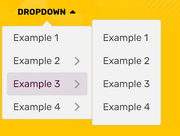
This CSS snippet by JustLeafy, makes the style of the dropdowns of the page header look more condensed.
.fandom-community-header__local-navigation .wds-dropdown__content {
	padding: 0 !important;
}

.fandom-community-header__local-navigation .wds-dropdown__content .wds-list.wds-is-linked > li {
	padding: 0 6px !important;
}
Wiki-themed scrollbar[]
This CSS snippet by Headquarter8302 styles the wiki's scrollbar with the current theme that is being applied, regardless of color and theme selection (light or dark). The snippet uses the relatively new scrollbar-color property introduced in the CSS Scrollbars Styling Module Level 1 spec.
:root {
  scrollbar-color: var(--theme-accent-color) var(--theme-accent-color--hover);
}
Line-height customization[]
Customizing line-height is useful for Indic scripts such as Devanagari, Bengali, Kannada, Odiya, etc due to mātrās (such ि, ी, ु and ू), flowing off the lines in specific locations and making it look untidy. It is recommended that all wikis in the mentioned languages use this:
.wds-community-header__sitename,
.fandom-community-header a,
#content h2,
#content h3,
#content h4 {
	line-height: 1.5;
}
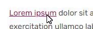
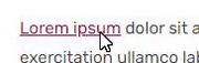
Link customization[]
This CSS snippet was created by Cleverduck09 to customize what links wiki-wide look like on hover, once they have been visited, and when they haven't been visited or hovered on, input the following code:
/* What the link looks like when you haven't clicked/hovered on it */
a:link {
	color: CODE;
	background-color: CODE;
	text-decoration: CODE;
	text-shadow: CODE;
	/* More CSS Attributes */
}

/* What the link looks like when you've visited it */
a:visited {
	color: CODE;
	background-color: CODE;
	text-decoration: CODE;
	text-shadow: CODE;
	/* More CSS Attributes */
}

/* What the link looks like when you're hovering on it */
a:hover {
	color: CODE;
	background-color: CODE;
	text-decoration: CODE;
	text-shadow: CODE;
	/* More CSS Attributes */
}

/* What the link looks like when you click it */
a:active {
	color: CODE;
	background-color: CODE;
	text-decoration: CODE;
	text-shadow: CODE;
	/* More CSS Attributes */
}
Profile background[]
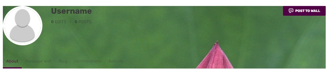
If you want to insert a background image that spans across of profiles of users, you can use:
#userProfileApp {
	/* insert URL to profile background image */
	background-image: url("<URL>");
}
Note: Add background-repeat: no-repeat; if you have added a wider image. They may not fit and will result in a repeating background.
Print/PDF sanitisation[]
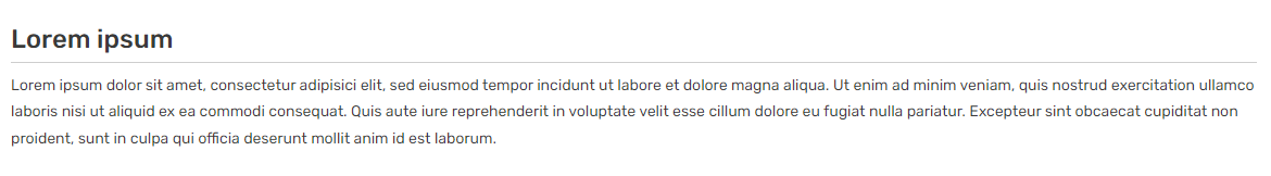
This stylesheet by Headquarter8302 distills the print/PDF output to a more print and PDF friendly format by removing most if not all Fandom elements and only leaving the Infoboxes and the content articles, while also making a lot of the page content much more legible. If you have found some elements that should be removed or if you want this to be turned into a fully-maintained stylesheet, please harass Markus (the author of this snippet).
Remember to put this inside MediaWiki:Print.css, and not your Common.css.
:root {
	--pi-border-color: black !important;
}

.fandom-sticky-header,
.global-navigation,
#mixed-content-footer,
.bottom-ads-container,
.top-ads-container,
.global-footer,
div[class^="InlineEntityFormWrapper_inline-entity-form-wrapper"],
#WikiaBar,
.page-side-tools__wrapper,
.page-header__actions,
.page__right-rail,
.community-header-wrapper,
.mw-editsection,
.page-footer__categories .wds-icon.wds-icon-small,
div[class^="Filters_article-comments-filters"],
#mw-data-after-content {
	display: none !important;
}

:not(pre > *),
:not(.mw-highlight > *) {
	background: white !important;
	color: black !important;
}

.main-container, .resizable-container {
	max-width: none;
	width: 100%;
	margin: 0;
}
Personalización de la barra de desplazamiento[]
Si quieres personalizar la barra de desplazamiento de tu wiki, puedes usar estos selectores CSS para aplicarle varias propiedades:
/* Hace que la barra de desplazamiento tenga 8px de largo */
::-webkit-scrollbar {
	width: 8px;
}

/* Hace que la línea de la barra de desplazamiento tenga un fondo negro */
::-webkit-scrollbar-track {
	background: black;
}

/* Hace que la barra en la barra de desplazamiento tenga un fondo verde */
::-webkit-scrollbar-thumb {
	background: #228B22;
}

/* Hace que el fondo de la barra de desplazamiento tenga una tonalidad más oscura de verde cuando se pasa el ratón por encima */
::-webkit-scrollbar-thumb:hover {
	background: #222;
}
Nota: La personalización de la barra de desplazamiento sólo se admite en algunos navegadores, como Chrome, Opera y Safari.
/* Change all of the scrollbars using properties supported for Firefox browsers */
* {
	scrollbar-color: #888 transparent;
	scrollbar-width: thin;
}
Resaltado de nombres de usuario[]

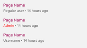
Este fragmento de CSS destaca los enlaces a la página de usuario de un administrador, al muro de mensajes, a las contribuciones y a la lista de blogs:
a[href$=":Nombre_de_usuario_del_Admin"],
a[href$="/Nombre_de_usuario_del_Admin"] {
	/* cambia el color del nombre de usuario */
	color: #006600 !important;
	/* hace que el nombre de usuario esté en negrita */
	font-weight: bold !important;
	/* cambia la fuente del nombre de usuario */
	font-family: Arial !important;
	/* More CSS Attributes */
}
Cambie "Nombre_de_usuario_del_Admin" por el nombre de usuario del administrador que desea resaltar, #006600 al color de resaltado deseado y Arial a la fuente deseada para el resaltado. También puede eliminar ciertas secciones si no las necesita en el resaltado.
a[href$=":Nombre_de_usuario_del_Admin"],
a[href$="/Nombre_de_usuario_del_Admin"],
a[href$=":Admin's%20Username"],
a[href$="/Admin's%20Username"]	{
	/* CSS Attributes */
}
In case there are other special characters in the username (such as & or ' ), those need appropriate encoding as well.
Change outline style[]
This minor CSS plug-in customizes the style of the outline. The outline means the blue border that appears when tabbing (using ↹ Tab to navigate a page). It is a style that is not to be confused with border. An outline is a line that is drawn around elements (outside the borders) to make the element "stand out".
a:focus {
	/* Sets the color of the outline */
	outline-color: green;
	/* Sets the amount of space between an outline and the edge or border of an element */
	outline-offset: 1px;
	/* Sets the style of the outline (e.g. dotted, dashed, solid etc.) */
	outline-style: solid;
	/* Sets the width of the outline */
	outline-width: 2px;
}
Note: Do not remove that outline as it is vital for making your wiki accessible to users who only use their keyboards.
Round corners on Special:Community[]
This snippet by Louky rounds corners of Community Page modules:
.community-page-card-module-header, .community-page-card-module {
	border-radius: 40px 40px / 40px 40px;
}
Pixelated images[]
This snippet by Rail makes sure that low resolution pixelart images are being displayed without antialiasing applied by Fandom's image processing service.
.mw-parser-output img {
	-ms-interpolation-mode: nearest-neighbor;
	image-rendering: -moz-crisp-edges;
	image-rendering: -o-crisp-edges;
	image-rendering: -webkit-optimize-contrast;
	image-rendering: crisp-edges;
}
Movimiento reducido[]
Este fragmento de CSS hará que la duración de todas las animaciones y transiciones CSS duren tan poco tiempo que dejan de ser notorias, mientras las mantiene funcional en caso de que haya scripts que dependan de animaciones y/o transiciones para funcionar. Esto puede ser útiles para quienes no les gusta las animaciones, tienen trastornos vestibulares provocados por el movimiento o quieren mejorar el rendimiento de la página. Este código solo tomara efecto si el usuario tiene la preferencia de prefers-reduced-motion en verdadero. Fragmento de web.dev.
@media (prefers-reduced-motion: reduce) {
	*, ::before, ::after {
		animation-delay: -1ms !important;
		animation-duration: 1ms !important;
		animation-iteration-count: 1 !important;
		background-attachment: initial !important;
		scroll-behavior: auto !important;
		transition-duration: 0s !important;
		transition-delay: 0s !important;
	}
}
También puedes remover el media query para aplicarlo en el wiki sin importar la preferencia del usuario.
[]
Allows links in the navigation bars to be keyboard-navigable (it's highly recommended to implement along with JumpToContent since it can drastically increase the amount of links keyboard users will have to navigate in each page before getting to its contents).
.wds-dropdown:not(.wds-is-touch-device):not(.wds-is-not-hoverable):is(:hover, :focus, :focus-within) .wds-dropdown__content,
.fandom-community-header__local-navigation .wds-dropdown__content .wds-list.wds-is-linked .wds-dropdown-level-nested:not(.wds-is-touch-device):is(:hover, :focus, :focus-within) > .wds-dropdown-level-nested__content {
	display: block;
}
Edit sections[]
Hidden edit sections[]
This CSS snippet by Александр III hides all edit links next to section headers.
.mw-editsection {
	display: none;
}
Change icon for edit sections[]
This CSS snippet by Laclale and KockaAdmiralac changes icon for all edit links next to section headers. You can change the URL that links to image.
.section-edit-pencil-icon, .mw-editsection .wds-icon {
	background: url('https://vignette.wikia.nocookie.net/ocraviutl/images/1/13/EditVester.png/revision/latest?path-prefix=ja') no-repeat;
}
.section-edit-pencil-icon use, .mw-editsection .wds-icon use {
	opacity: 0;
}
Transparent strikes[]
This CSS snippet by Leslie1289 makes <s> and related elements semi-transparent. Example.
strike, s, del {
	opacity: 0.5;
}
Semi-transparent page background[]
The background of the content area is currently opaque, meaning the wiki background image behind it is not visible. To set that background semi-transparent while keeping the color picked via Theme Designer, use:
.page__main {
	background-color: rgba(var(--theme-page-background-color--rgb), 0.96);
}
The value of 0.96 is the opacity and it can be increased or decreased, but it's not recommended to lower it too much since the background image behind might make the text hard to read.
The code above would still leave the right rail and the bottom Fan Feed opaque. In order to make them semi-transparent too, the following extended version can be used instead:
.page__main,
.page__right-rail,
#mixed-content-footer {
	background-color: rgba(var(--theme-page-background-color--rgb), 0.96);
}

.page__right-rail .rail-module {
	background: transparent;
}
Sticky search bar on Special:Search[]
This simple snippet by User:SuperDragonXD1 makes the search bar, alongside the related wikis and filters sidebar on Special:Search and Special:SearchCommunity.
/* Search bars being sticky */
.mw-special-Search form.unified-search__form, .mw-special-SearchCommunity form.unified-search__form {
	position: sticky;
	top: 42px;
	z-index: 1;
}

/* Tabs on the left being sticky */
.mw-special-Search .unified-search__layout__left-rail {
	position: sticky;
	top: 100px;
	align-self: flex-start;
}

/* Related community section being sticky */
.mw-special-Search .unified-search__layout__right-rail {
	position: sticky;
	top: 85px;
	align-self: flex-start;
}

/* General rule */
.mw-special-Search div#content, .mw-special-SearchCommunity div#content {
	overflow: unset;
}

/* Prevent overlapping of the search bar if there are more CSS customizations */
.mw-special-SearchCommunity .unified-search__result {
	margin: 8px;
}
FAB TOC only[]
This CSS snippet sets a middle ground between showing all Table of Contents (TOC) and not showing any of them, by hiding the TOC in the article but keeping the one in the Floating Action Button (FAB) on the top left of the page (or top right if you're on mobile). The in-page's TOC can still be accessed through keyboard navigation.
#toc:not(:focus-within) {
	clip: rect(1px, 1px, 1px, 1px);
	overflow: hidden;
	position: absolute;
}
Rail toggle button as FAB[]
The rail toggle button doesn't scroll with you as the buttons on the left side does, making you have to scroll to the top of the page to toggle the side bar, so this personal CSS snippet gives that specific button the same styling as the other Floating Action Buttons (FABs) so it follows you around when you scroll.
/* Adds FAB styling to the rail toggle button */
.page__right-rail > .right-rail-toggle {
	-webkit-box-pack: center;
	-webkit-box-align: center;
	align-items: center;
	background: var(--theme-page-background-color);
	border: none;
	border-radius: 50%;
	-webkit-box-shadow: 0 3px 12px 0 rgb(0 0 0 / 30%);
	box-shadow: 0 3px 12px 0 rgb(0 0 0 / 30%);
	color: var(--theme-link-color);
	cursor: pointer;
	display: -webkit-box;
	display: flex;
	height: 36px;
	justify-content: center;
	margin-bottom: 9px;
	margin-top: 18px;
	outline: none;
	padding: 0;
	position: sticky;
	top: 58px;
	-webkit-transition: color .3s;
	transition: color .3s;
	width: 36px;
}

.page__right-rail > .right-rail-toggle:focus-visible {
	outline: 2px solid var(--theme-link-color);
}

.page__right-rail > .right-rail-toggle:hover,
.page__right-rail > .right-rail-toggle:focus {
	color: var(--theme-link-color--hover);
}

.page__right-rail > .right-rail-toggle {
	float: right;
	transform: translateX(18px);
}

/* Restores rail's original position and width */
.right-rail-wrapper {
	transform: translateY(-63px);
	width: 100%;
}
HTML theme colors[]
This snippet sets the accent color for user-interface controls generated by some default HTML elements as well as the scrollbar. Note that accent-color is enabled by default only in recent browser versions, and color-scheme has wider browser support.
The following snippet assumes that your wiki is light-theme by default, but you can invert the color-scheme value to dark light if your wiki is dark-themed by default, and you also may want to change the class .theme-fandomdesktop-dark to .theme-fandomdesktop-light to properly update the color scheme for light theme.
/* Undefined/light theme */
:root {
	accent-color: var(--theme-link-color);
	color-scheme: light dark;
}

/* Dark theme */
.theme-fandomdesktop-dark {
	accent-color: var(--theme-link-color);
	color-scheme: dark light;
}
Sticky table headers[]
You can make table header cells follow your screen so users can permanently see what each column is about. To do so, you use the following CSS:
/* Allows sticky elements to work inside the page's content. */
#content {
	overflow: initial;
}
Then you can make header cells sticky. Here we will show two methods: one that only checks for the table class nd other that checks for each cell's class.
/* Method 1: check for table's class. All header cells of that table will be sticky. */
table.sticky-header th {
	position: sticky;
	top: 45px;
}

/* Method 2: check only for table header cells with the "sticky-header" class. */
table th.sticky-header {
	position: sticky;
	top: 45px;
}
[]
The following snippet aligns the footer section in mobile to not obstruct any elements above as it can clash with interactive maps and navboxes.
- Note: This snippet should only be added either to your personal CSS, or to your local
FandomMobile.css. It won't work if it's added elsewhere, or if mobile CSS hasn't been enabled for your community.
.article-footer {
	transform: unset;
}

.article-footer-item, .article-information-header, .wds-font-size-base {
	transform: unset;
}
Remove mobile main page elements[]
The following snippet comes from Sky Children of the Light Wiki, in which it removes elements from the native main page in mobile in order to have the wiki's main page to only show at the top.
- Note: This snippet should only be added either to your personal CSS, or to your local
FandomMobile.css. It won't work if it's added elsewhere.
.mobile-main-page__wiki-description {
	display: none !important
}

.mobile-main-page__trending-articles {
	display: none !important
}

.mobile-main-page__popular-categories {
	display: none !important
}

.mobile-main-page .mobile-hidden {
	display: block !important
}
Personalizaciones de usuarios[]
WikiEditor Syntaxhighlight Extensions[]
Personal CSS only: This CSS extension pack by Suggon adds a few visual fixes and syntaxhighlight features into the 2010 wikitext editor; some being inspired by VSCode.
- Enable editor overscrolling
- Fix occasional "disappearance" of text cursor
- Line highlight on mouse hover
- Comprehensible matching-brackets
- Outline for lines with matching-bracket
- Left border for lines between matching-brackets — handy for debugging nested parser functions
.CodeMirror {
	caret-color: var(--theme-page-text-color);
}
.CodeMirror * {
	transition-property: background-color, box-shadow, filter;
	transition-duration: 0.2s;
}
.cm-mw-matchingbracket {
	background-color: transparent !important;
	box-shadow: 0 0 0 0.5px rgba(128,128,128,.5) !important;
	filter: brightness(2);
	.theme-fandomdesktop-light & {
		box-shadow: 0 0 0 0.5px rgba(0,0,0,.5) !important;
	}
}
.CodeMirror-line:hover {
	background-color: rgba(128,128,128,.1) !important;
}
.CodeMirror-line:has(.cm-mw-matchingbracket) {
	box-shadow: inset 0 0 0 2px rgba(128,128,128,.2);
}
.CodeMirror-code div:last-child {
	height: 50vh;
}
.CodeMirror-code div:has(.cm-mw-matchingbracket), .CodeMirror-code div:has(.cm-mw-matchingbracket) ~ div {
	box-shadow: -1px 0 #0af;
}
.CodeMirror-code div:has(:nth-child(2 of .cm-mw-matchingbracket)) ~ div, .CodeMirror-code div:nth-child(2 of :has(.cm-mw-matchingbracket)) ~ div {
	box-shadow: none;
}
.CodeMirror-gutters {
	margin-left: -0.5px;
}
Remove Search Tooltip[]
Personal CSS only: This is a very simple user customization which removes the yellow tooltip indicating options to search specific, highlighted text.
#highlight__main-container {
	display: none;
}
Personalización del cursor[]

Personal CSS only: sitewide use violates customization policy.
If you want to change the icon displayed as your cursor, you can use:
/* This cursor icon will be displayed normally */
html {
	/* inserta la URL del icono del cursor */
	cursor: url("<URL>"), default;
}

/* This cursor icon will be displayed when hovering or clicking on links */
a:hover, a:active {
	/* inserta la URL del icono del cursor */
	cursor: url("<URL>"), pointer;
}
Detecta la plantilla Nombre de usuario[]
Este fragmento de CSS creado por TheGoldenPatrik1 ubica un borde al rededor de la plantilla {{USERNAME}} para prevenir que los usuarios sean engañados por eso:
.insertusername,
.inputusername,
.InsertUsername,
.InputUsername {
	border: 1px solid;
	padding: 0.5px;
}
Fix "Mark All As Read" button[]
This personal only CSS snippet by Headquarter8302 fixes the issue where the floating wiki navigation bar covers the top of the notifications popup, and thus, covering the "Mark All As Read" button. The snippet below changes the z-index of the notifications popup and the header:
.fandom-sticky-header.is-visible {
	z-index: 499;
}

.notifications header[class*="NotificationsDropdown-module_contentHeader"] {
	z-index: 500;
}
Force default cursor[]
This personal only CSS snippet forces all cursors to become default. This means that custom wiki cursors will be restored back to default. It also replaces the hand cursor when hovering over links with the default cursor.
body,
* {
	cursor: default !important;
}

a:hover {
	cursor: pointer !important;
}
Ocultar categorías de portada[]
Este fragmento de CSS solo para uso personal creado por JustLeafy impide que la barra inferior de la categoría aparezca en la portada:
.mainpage .article-categories, .mainpage .page-footer__categories {
	display: none;
}
Hide main page title[]
This personal-only CSS snippet by DiegoFire Network and KockaAdmiralac removes the title of a wiki's main page.
.mainpage .WikiaPage .page-header__title,
.mainpage .WikiaPage .page-header__separator,
.mainpage #firstHeading {
	display: none;
}
Minified PPH[]
This personal-only CSS snippet by KurwaAntics minifies Fandom's new article header by removing the category list and language dropdown button on the top of the header and reducing the article's title's font size:
.page-header__categories,
.page-header__languages {
	display: none;
}
.page-header__title {
	font-size: 34px;
}
Previous WDS Button design[]
This minor CSS plugin by JustLeafy makes the buttons look like the previous style before they had rounded corners and a larger font size.
.wds-button {
	padding: 7px 12px;
	font-size: 10px;
	border-radius: 0 !important;
}
Retro 2010 ACE Editor[]
This CSS snippet by Headquarter8302 makes the 2010 ACE Editor text have a glowy text effect, similar to Windows Terminal's retro terminal setting.
.ace_line {
	text-shadow: 0 0 5px currentColor;
}
Personalización de selección[]

Este fragmento de CSS creado por JustLeafy hace que el color de fondo de la selección sea semitransparente.
::selection {
	background: rgba(120,120,120,0.5);
}
Smooth page load[]
This personal only CSS code by Cleverduck09 creates a short fade-in animation on wiki pages.
@keyframes pageload {
	from { opacity: 0; }
	to { opacity: 100; }
}
body,
.Message__content,
.wds-dropdown,
.wds-tabs__tab,
.wds-dropdown__toggle,
.client-js {
	animation-name: pageload;
	animation-duration: 0.4s;
	animation-iteration-count: 1;
	animation-delay: 0s;
}
Change diff highlights[]
This CSS snippet by RyaNayR adds a red outline-border to diff-change highlight color-scheme. This would presumably greatly increase visibility of small, one-character changes, while also remaining palatable to the eyes on larger diffs, when anyone on your wiki is reviewing edit-differences.
.diffchange {
	border: 1px solid #f00;
}
Remove Fan Feed[]
This is a simple personal CSS snippet that removes the Fan Feed which is located at the bottom of the main page, article pages and file pages.
#mixed-content-footer {
	display: none;
}
Caret color[]
Caret color is a simple stylesheet that gives the caret (or text indicator cursor) a different color. Currently, the caret can only be colored with the caret-color, but the width and other properties are not customizable yet because these properties don't exist yet. This minor CSS plug-in will affect the caret in all textareas. Note that the caret color here is red, but it can definitely be changed to a different color.
textarea {
	caret-color: red;
}
Hide read feeds/announcements notifications[]
This CSS snippet added by Andrewds1021 and KockaAdmiralac hides read notifications in the Feeds/Announcements notification drop-down (the bell icon in the global navigation header). It also re-works how the horizontal rules are added between notifications such that the last unread notification is not followed by an extraneous horizontal rule. This is for personal use only.
/* Hiding read notifications */
#notificationContainer .wds-notification-card:not(.wds-is-unread), .notifications li:not([class*="isUnread"]) {
	display: none;
}

/* Re-working horizontal rules */
#notificationContainer.wds-has-lines-between > li {
	border-bottom: 0;
	border-top: 1px solid #bed1cf;
}

#notificationContainer.wds-has-lines-between > li:first-child {
	border-top: 0;
}
Large thumbnails in Dynamic Categories[]
This CSS snippet by HumansCanWinElves and partially based on Fandom's own stylesheet, turns all the entries in category pages to look like the "Trending pages" at the top - four columns with large thumbnails. This works for users who use the default "Dynamic Categories" view.
The images look somewhat blurry, since they are low-resolution thumbnails enlarged by CSS.
Entries without an image will display the Fandom logo, and this can be replaced by changing the URL in the middle of the code. In this case, usually you will also want to change the "80%" size definition to "100%".
.ns-14 #content .category-page__members.category-page__members {
	column-count: 1;
}

.ns-14 #content .category-page__members-for-char {
	display: -ms-inline-flexbox;
	display: grid;
	-ms-flex-wrap: wrap;
	grid-gap: 20px;
	grid-template-columns: repeat(4,1fr);
	margin-left: 0;
}

.ns-14 #content .category-page__member {
	flex-direction: column;
}

.ns-14 #content .category-page__member-left {
	width: 160px;
	height: 120px;
	background: url(https://static.wikia.nocookie.net/740bff54-a89f-4c0a-97a1-a97c6b1a77a7) no-repeat center center/auto 80%;
	border: 1px solid;
	justify-content: flex-start;
}

.ns-14 #content .category-page__member-thumbnail {
	width: 160px;
	height: 120px;
	border: none;
}

.ns-14 #content .category-page__member-link {
	text-align: center;
}
[]
This short, personal only, snippet by BlindCartographer stops the stickied top navigation from ever appearing.
.fandom-sticky-header {
	display: none !important;
}